Keep up with our latest news and projects!

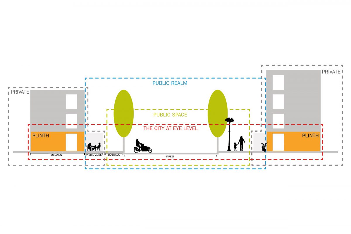
A plinth is the ground floor of a building. It is a building’s most crucial part for the city at eye level. What do you as a pedestrian experience when you look around? Do the buildings, their use, and their design make an attractive urban environment where you feel at home? Do the plinths connect with pedestrian flows in the urban area? What are good functions for plinths? Which set of actions and partnerships are needed to transform dysfunctional plinths? The last few years, Stipo has worked on all kinds of plinth strategies: from the CityLounge programme in Rotterdam’s inner city to the transformation of Amsterdam’s ugliest street into a welcoming street; from fashion in Arnhem’s Klarendal to better plinths in regeneration and residential areas.
The city is not only a functional environment, but also an environment of experience. Function has been fairly dominant in the past few decades, due to the combination of a large post-war building production and the industrialisation of the construction process. However, now we experience, in western economies at least, the shift from ‘making the city’ to ‘being the city’. New construction and areas of growth will persist, but the reinvention of existing urban structures will become more dominant.
After the decades of functionalism, perhaps now a correction is necessary: more attention on the urban experience, or urban warmth as we call it from an urban psychological point of view. Besides, the knowledge economy, the ever larger interconnectivity on a global level, co-working, the increasing competition between shopping and residential areas, the growth of urban-oriented people with a higher education, and the growing number of single and double households not only cause a massive revaluation of the city as a whole, but also make the experience of that city ever more important. The squares, parks and terraces are the places where knowledge workers exchange their ideas. Places with retail and culture attract more people, and so do residential areas with an urban feel. It is all part of the larger movement of the urban renaissance caused by new interest in cities with mixed urban areas and great public spaces.
Urbanites experience their cities in what we call the ‘public realm’. It has a broader meaning than just ‘public space’; it includes façades of buildings and everything that can be seen at eye level. Plinths are therefore a very important part of buildings: the ground floor, the city at eye level. A building may be ugly, but with a vibrant plinth, the experience can be positive. The other way around is possible as well: a building can be very beautiful, but if the ground floor is a blind wall, the experience on the street level is hardly positive.
Plinths are crucial for the experience and attractiveness of the urban space, both in residential and commercial areas. Research shows that if the destination is safe, clean, relaxed and easily understood, and if visitors can wander around with their expectations met or exceeded, these visitors will remain three times longer and spend more money than in an unfriendly and confusing structure. Good plinths are in the interest of the urban economy, and not only because of consumer spending. A balanced labour market with enough people with a higher education demands a functional urban environment for living, shopping and playing. The knowledge and experience economy requires spaces with character, a good atmosphere, a place to meet and to interact. The entire urban environment shapes this atmosphere, but plinths play a key role. The ground floor may be only 10% of a building, but it determines 90% of the building’s contribution to the experience of the environment.
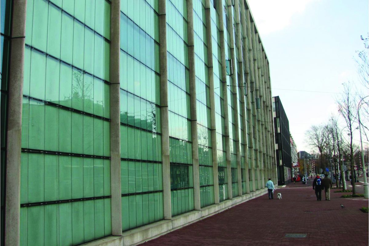 The square Mr. Visserplein in the inner city of Amsterdam: no doors, a close façade. Good plinths are not self-evident.
However logical this all may seem, we do not experience good plinths everywhere in cities. Why is that? In the projects we have worked on, we have found all kinds of reasons why the combination of interventions by government and market parties do not necessarily lead to good plinths.
Many buildings of the past have been designed from a different design perspective and their plinths are simply not suitable for attractive public functions. Also the development of ‘drawing functions inside’ directs the attention more to the inside world rather than the urban environment: shopping malls, multifunctional complexes for leisure, care clusters and campuses often are bad examples of these. Monofunctional layouts and primary attention for car use worsen the situation, as do single-use office areas.
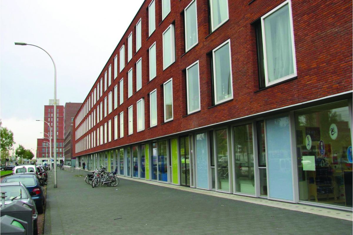 Primary school in the child rich newly built neighbourhood Ypenburg (The Hague) thatover twenty years easily can be transformed for other purposes
When a plinth is successfully created, retail, cafés and restaurants often provide the highest profits. As a result of this, attention is directed at commercial functions for most (re)development projects. But is this sustainable? The last ten years the Netherlands saw a 50% increase in surface space dedicated to retail, while turnover in the sector remained the same. In the coming years the retail sector expects an additional 30% to disappear as a consequence of internet shopping. These trends require a new perspective for programming plinths with different functions, such as properly designed housing on the ground floor. We should stop clustering social functions such as primary schools in new multifunctional (and introvert) buildings, but start to create spaces in flexible plinths that can change to new uses every decade or so.
Many streets are under pressure; they have lost foot traffic and vacancy is increasing. Streets leading towards the city centres, streets around (public) transport junctions, streets in working areas and streets in residential areas are faced with vacancy or discrepancy (no suitable uses and/or a poor image). This trend can partly be seen as a natural urban life cycle, and partly as a consequence of other influential causes, such as the focus of shifting inner cities, poor rental policies, or design failures.
As residential functions, co-working, shopping and leisure are more and more footloose, experience is becoming more and more important. New trends can improve the quality of plinths, such as small-scale shopping, the need for new co-working cafes, temporary creative functions, and pop-up stores. In any case, a good plinth strategy will have to embrace a wide range of functions, including social functions and houses on the ground floor.
Besides these trends it is useful to look into some of the most important players’ positions: developers, owners, entrepreneurs, and renters. For project developers, the plinth is most of all part of their building, rather than part of a street. On top of that, plinths are financially of secondary importance: when there is enough support for the offices or apartments on the higher floors, construction can start. A plinth in use is then a bonus but not a breakpoint for the investment decision.
Office owners are satisfied when they can rent 90% of their buildings. For them, the plinth is often an entirely different, difficult and fragmented market. In most single-user office buildings the ground floor is merely an entry or security point. From the user’s viewpoint, as we can see in many office streets, these plinths contribute very little to the quality and attractiveness of the urban public realm.
Unfortunately, also many designs fail. Not all but many architects are focused more on designing buildings rather than creating good streets. And also in the design of the adjacent public realm all kinds of interests play a role, such as traffic, and experience and residential quality do not necessarily come first. And there are private users who sometimes prefer (and are allowed) to have closed shutters towards the street.
Although we all realize their importance, good plinths are not in the least self-evident. The coming decades will add more economic pressure to plinths, and local authorities and property owners will have to collaborate if they want good streets. To put it differently: attaining good plinths and a good urban experience requires an active government and an active market. A strategy is needed in which governments, developers, designers, owners, and renters each play their own parts. And because each neighbourhood and each street is different, they each require a different strategy.
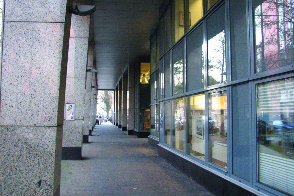 Weesperstraat Amsterdam, offices often don't have attractive plinths
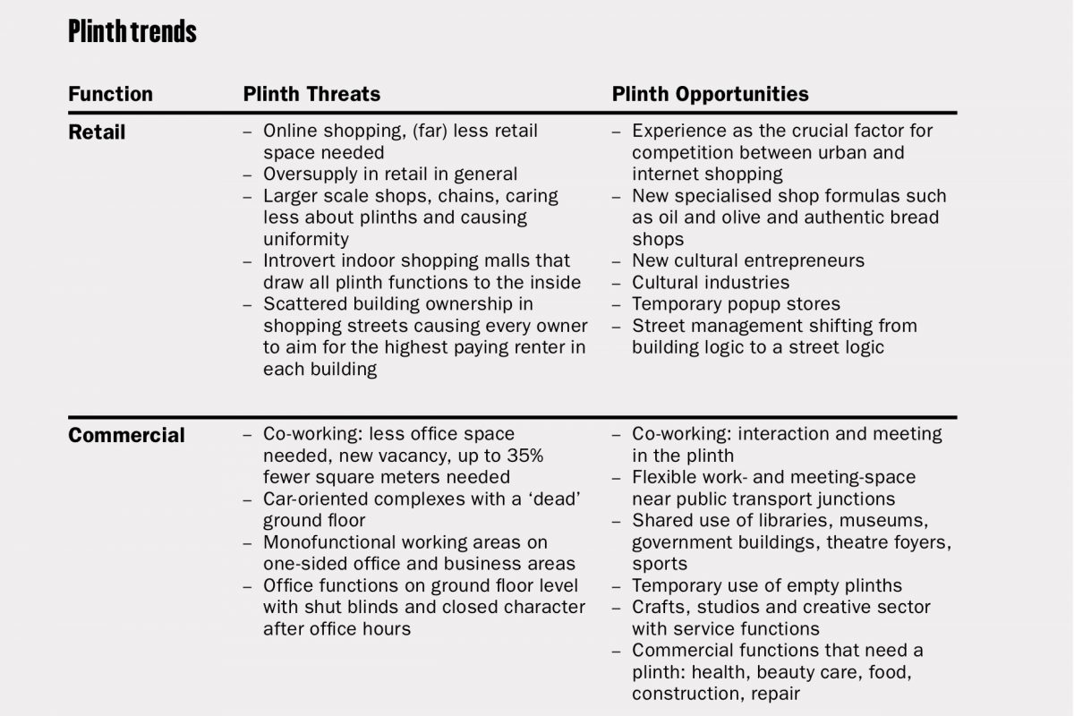
In practice we not only see a new interest from both the users and the designers point of view, but we are also faced with massive changes on the programme side. Functions as retail, residential, commercial, and social functions face recent developments that provide threats and opportunities for plinths.
Seeing these trends, we find that good plinths cannot be made by retail only. According to some estimates, due to the combination of the oversupply created in the last ten years and the rise of internet shopping, half the current shops will disappear from our streets. Of course, new formulas will come up, but it is clear that we cannot solely rely on shops to create a better public realm. Therefore, in setting up plinth strategies, we also look at new economic functions such as co-working places, restaurants and cafés, social functions such as schools, and most of all residential space on the ground floor.
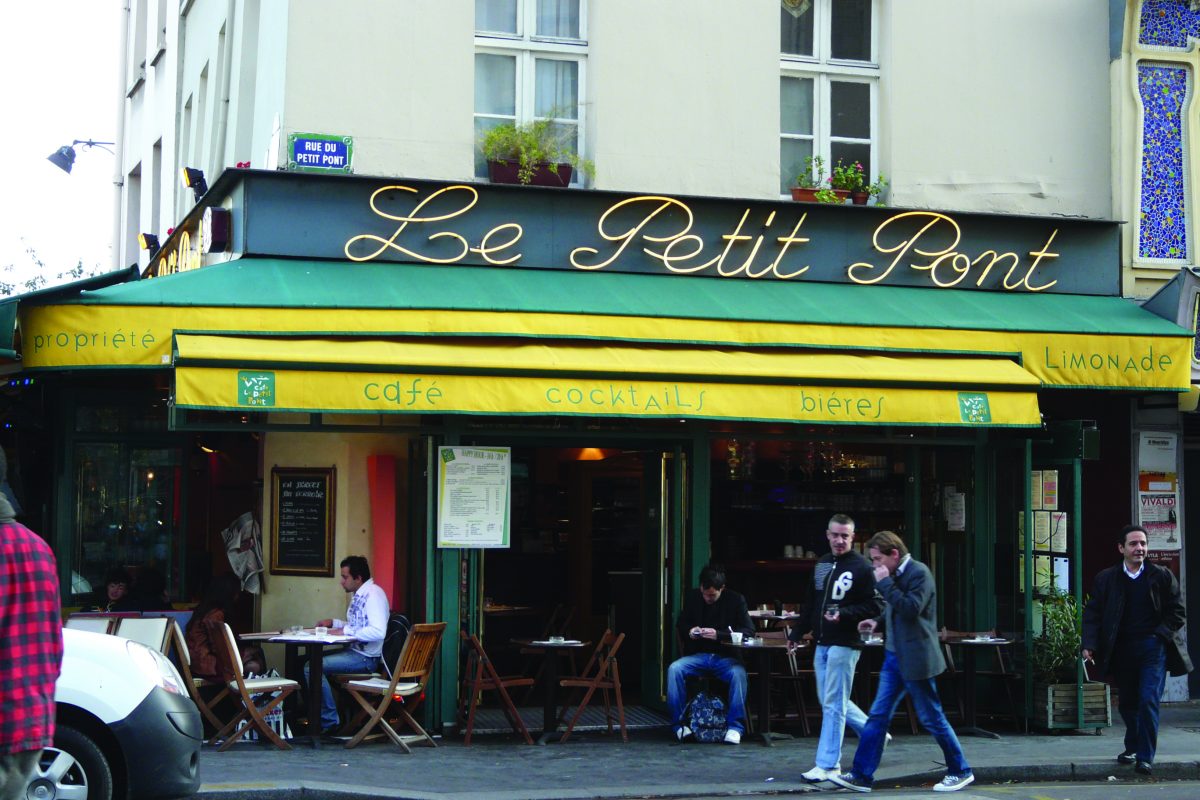 Paris, a vibrant plinth
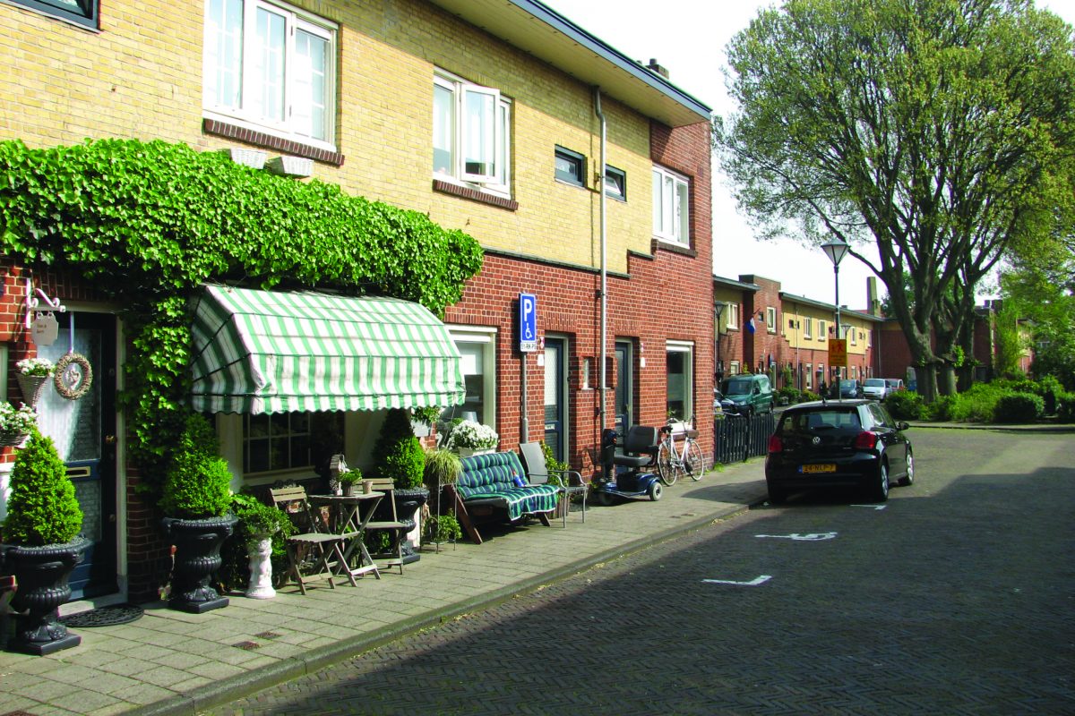 Haarlem, simply good houses in the plinth
Rotterdam is a good example of what a plinth strategy can mean for a city. Rotterdam is looking for contemporary ways to improve the residential qualities of its inner city with methods that suit the post-war reconstruction character, realizing that the image of the city as a whole largely depends on the image of the inner city.#After a pilot on three streets, the urban planning department, the inner city project team, the economic department and Stipo analysed the situation in the city centre. This led to a new analytic language examining pedestrian flows at different moments of the day, the increase of property values and mapping places of “let’s meet at…”. We also made a function map for the city at eye level only. The map made clear how the inner city ground floors are made up of monofunctional islands of living, working, culture and shopping. By combining the layers of the analyses, we identified ten areas where intervention is needed, with distinct approaches on the short-, mid- and long-term.
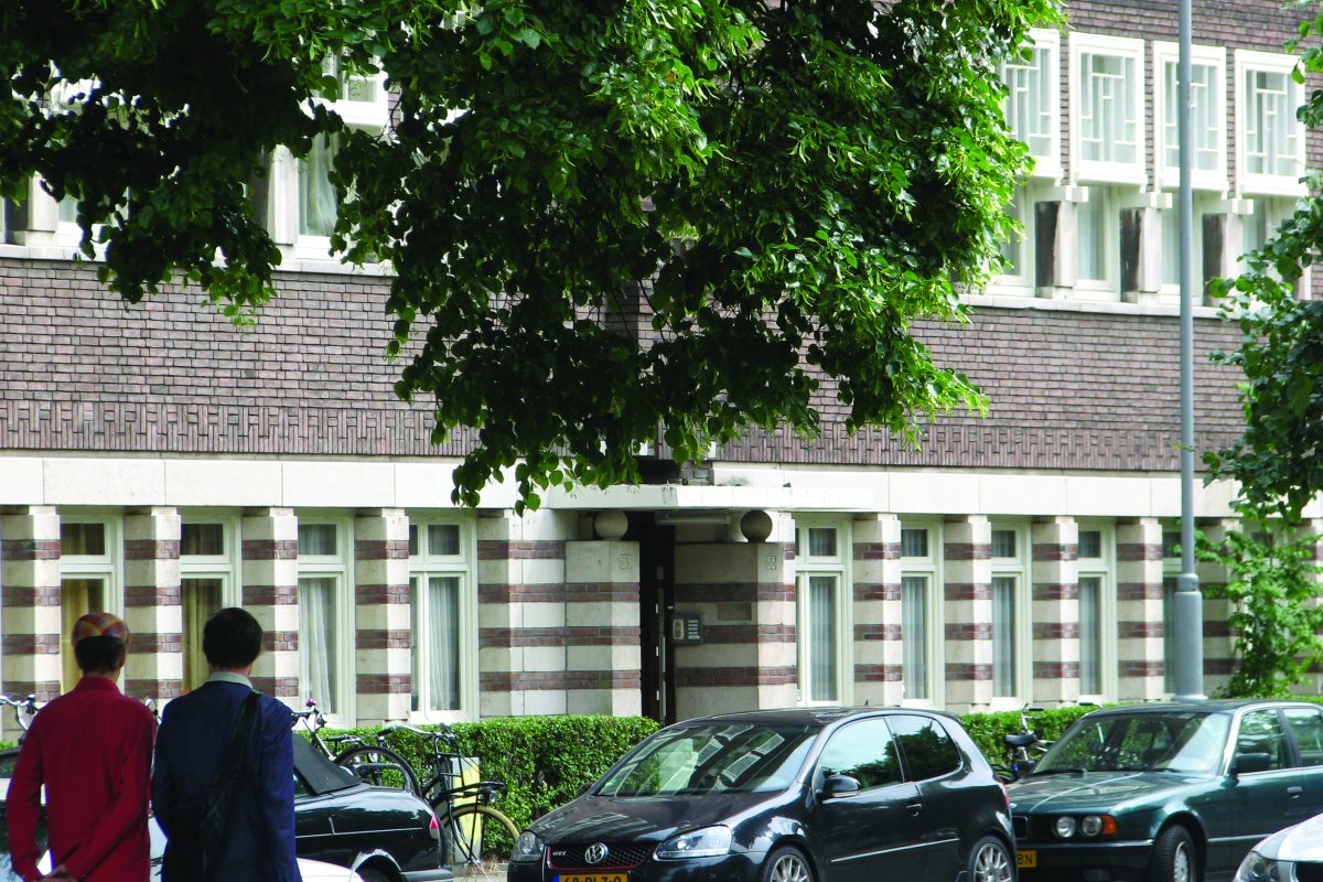 Plan South of Berlage in Amsterdam, well designed residential function in the plinths
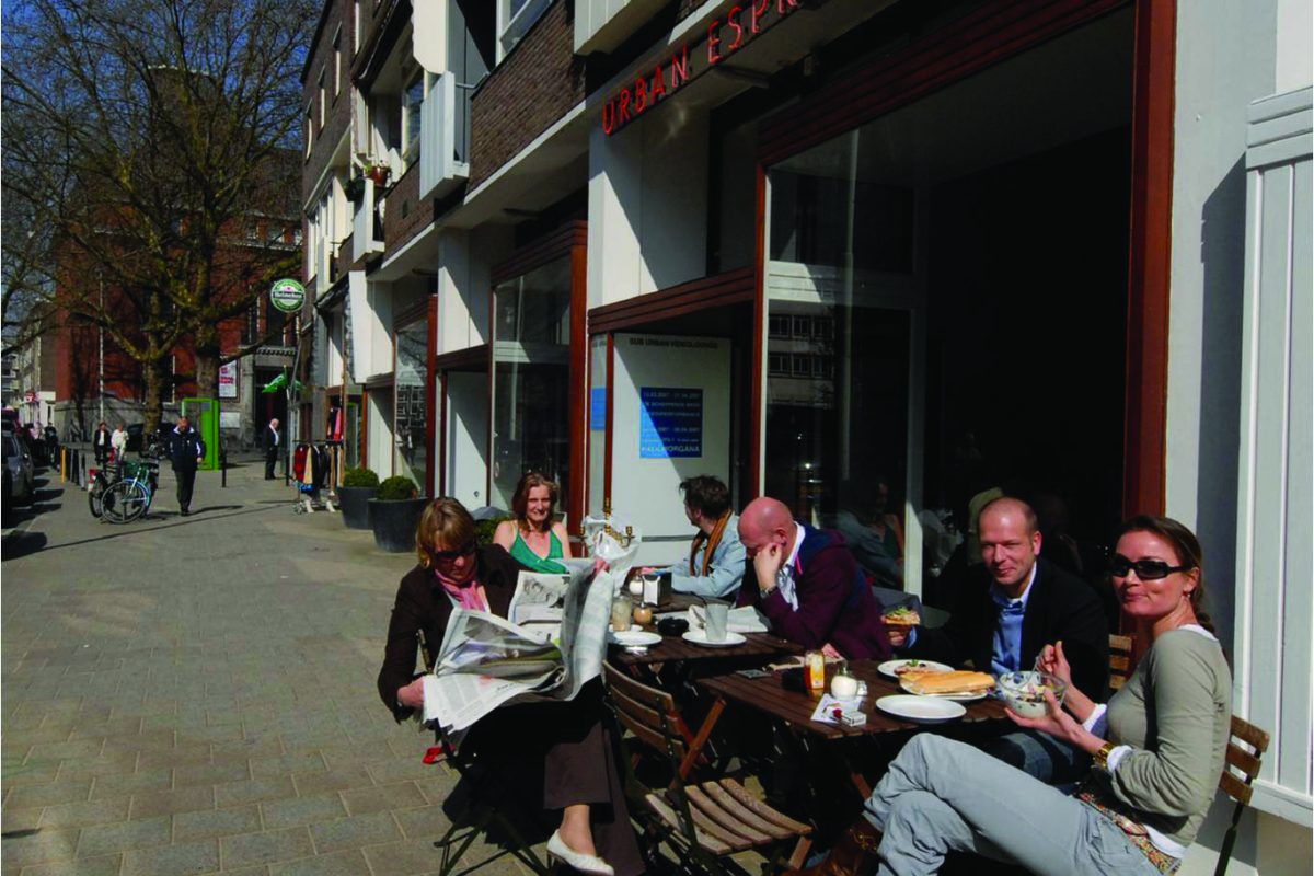 Inviting plinths at Botersloot Rotterdam
One aspect of good and varied streets is to have compact concentrations of different functions in the plinth. For Amsterdam’s Weesperstraat we compared which kind of units are found at which distance. We compared some of the internationally renowned ‘Great Streets’ (Allan Jacobs): Regent Street in London, Les Champs-Elysées and Boulevard St. Michel in Paris, and Paseo de Gracia in Barcelona. In The Netherlands we analysed vibrant streets such as Amsterdam’s Haarlemmerdijk and Overtoom and Rotterdam’s Meent, and less lively streets such as Rotterdam’s Weena, and Amsterdam’s Wibautstraat and Weesperstraat.
Our main conclusions are:
Weesperstraat in Amsterdam has an average of one public function every 103 meters. Haarlemmerdijk, on the other side of the spectrum, has a public function every 8 meters. However, the Weesperstraat analysis showed that it is possible to adapt the existing buildings’ ground floors in such a way that the street would approach the Great Streets average. Combined with its good location in the city of Amsterdam, Weesperstraat could become a better street for pedestrians. This is a strategy we currently work on in close collaboration with the local authority and the property owners, creating a vision and a coalition to transform this car-oriented office street into a metropolitan street that combines traffic and space for pedestrians.
What then are good and bad plinths? In cooperation with the City of Rotterdam, and referring to previous research and articles such as ‘Close encounters with buildings’ (Jan Gehl, 2006), ‘Towards a Fine City for People’ (Jan Gehl, 2004) and ‘Great Streets’ (Allan Jacobs, 1995), and using our own experience in practice, Stipo has developed a three-layer set of criteria that should be part of each analysis and strategy for plinths: building, street, and context.
Each of these levels provides ‘buttons’ to push for a plinth strategy. The levels cannot be separate from each other, they interact; without enough people living in the area, for instance, or lack of purchasing power, a shop can have a fantastic plinth, but still will find it hard to survive. A single building may be well-designed (from a street perspective), but if the rest of the street has blind façades it will not function on its own. A street may look great, but if it is not connected to the main streams of pedestrians in the city centre, it will be difficult.
By analysing the plinths along these levels Stipo built a joint vision, supported by the partners (owners, renters, government) and helped implement it, including temporary and new street concepts.
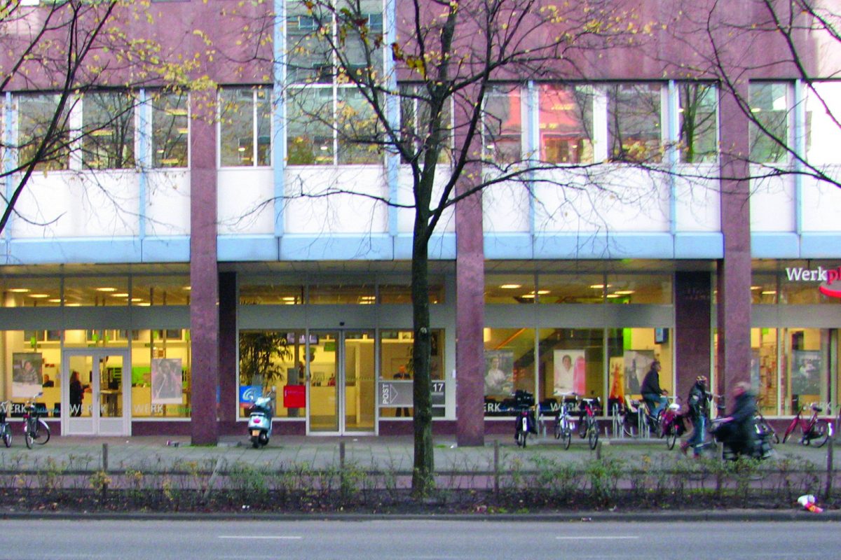 Criterium Building
Interested? Join The City At Eye Level and share your story!
Discover more