Keep up with our latest news and projects!

As humans we are focused on meeting other people, for which we need the urban public realm. In that domain the human scale is important as well as the vibrancy of the place – both are provided by plinths. A city that has a better public realm, will be more successful in the long run. This refers not solely to the plinth but to the whole design of the street and public spaces; street and plinth need each other.
In many office areas, buildings are positioned in a (parking) field and the public space is mainly determined by the car for access and parking. Where the car is dominant, it is usually not an attractive place where you want to be. There might be a need for such areas, but they are not the lively streets and neighbourhoods that are part of the urban system. The Amsterdam-Zuidas is an example of a well designed mixeduse office area: the design has been thought from the public domain with the main entrances to the street, and no dominance by the car.
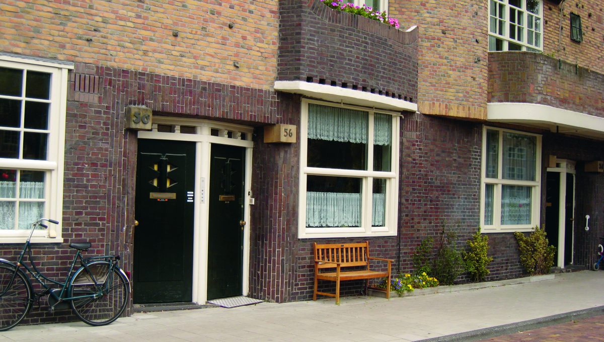 Residential plinth in Amsterdam
My inspiration for urban design and plinths comes from the European city before the mass use of the car. Plinths are often assumed to be non-residential. But most of the high density urban areas in Amsterdam are residential. These attractive areas are to be found in the European city areas from before the 20th century. In the modernist architecture and urbanism this city of streets has been lost: the street was seen as vacant space between the buildings. However this is especially the place where urban life takes place and which need to be designed as a domain with attractive façades and plinths.
Many of the attractive streets in the city are ordinary residential streets. You’ll find them in Amsterdam-South but also in AmsterdamEast and in Old-West. Those streets have a sophisticated plinth design between the ground floor of the house and the public space. The design of the plinth should be a combination of generous and reserved – a resident needs privacy. The size of the window is important: the residents should not hide behind blinds or curtains in a too big window, or behind a too small kitchen window. The hardest to design is a street with mutual satisfaction for both residents and people walking along or driving by. This needs a fine detailing of the plinth, and can be provided by small front gardens or private zones along the sidewalk.
IJburg is in this case an example where the housing and building blocks have a good design of the ground floor that relates to the public street. For the plan of IJburg we had a good look at the streets and canals of old Amsterdam. Also Borneo-Spoorenburg in the Eastern Docklands is in my opinion a good example; here the plinth of the houses has a patio or carport and makes a good balance between front and rear entrance, between formal and informal. The sidewalks are wide enough to sit outside, so the residents are gradually occupying parts of this 3.5 meter wide zone with benches, planters and geveltuintjes (sidewalk gardens).
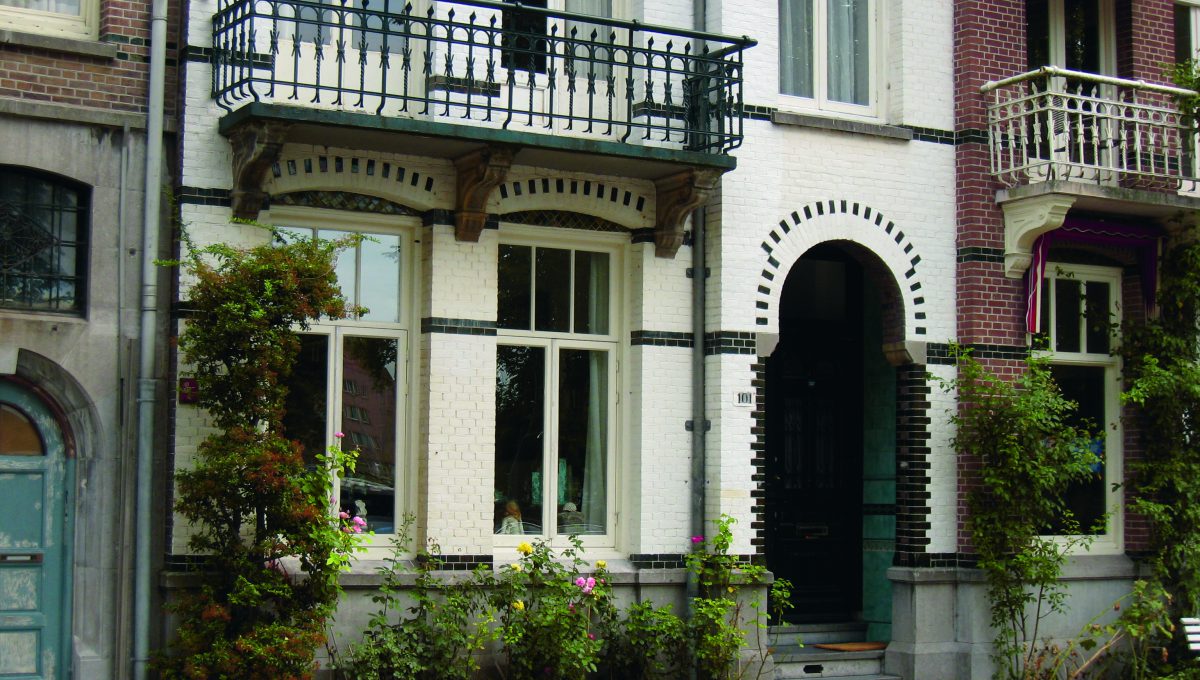 19th century housing with “Geveltuintje”
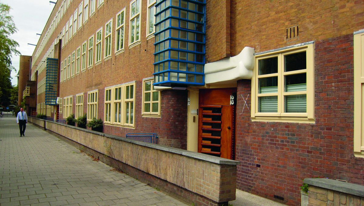 Private zone between plinth and sidewalk
The design attitude of the urbanist and architect is important: do you consider the street as the remaining area between buildings, or as the heart of the city. As an architect you should be humble and start designing from the street, not from the building. You need to design good and pleasant entrances and ground floors. In suburbia is more need for private enjoyment, but in urban areas you should make good streets. And good streets have a well designed street profile (the ratio between street width and building height), including trees.
The plinth is important for the street as are the upper floors: the whole façade of the building contributes to the vibrancy of a street. The 19th century belt around the Amsterdam innercity is a good example, but should not be romanticized. In the years after construction these neighbourhoods were often overcrowded and had a different use. Due to the growth of the city, these neighbourhoods are no longer peripheral but central located in the city. Thus I plea to build generic buildings and plinths that can absorb many functions: not form follows function, but flexibility for different use.
The plinth design is an architectural challenge: the height of the floor, the size and position of the windows and the entrance, and also the elevation of the ground floor is important. When the ground floor is slightly elevated above street level, the privacy of the habitants is secured. Seated inside, they have the same perspective and eye level as a passer-by. To design this well is difficult, because a house is built by a developer and the street is laid out by the municipality. As a designer you have to think of creative solutions, because the rules of the Dutch Bouwbesluit (building act) are adapted for houses in suburbia but are too oppressive for high density districts.
The height of the ground floor is important to have enough sunlight inside as well for the flexibility for non-residential functions. Also for the street profile, the measure of the plinth is important: high ground floors give atmosphere. The height of the plinth is also a reflection of the city: in a chic city like Milan you have a plinth of up to 6 meters high, which fits the grandeur of the buildings and streets. In the small historic city of Delft the plinth height is related to the cosy size of the canals and buildings. It is not the absolute size that matters, but the proportions of the building and it’s façade related to the profile of street.
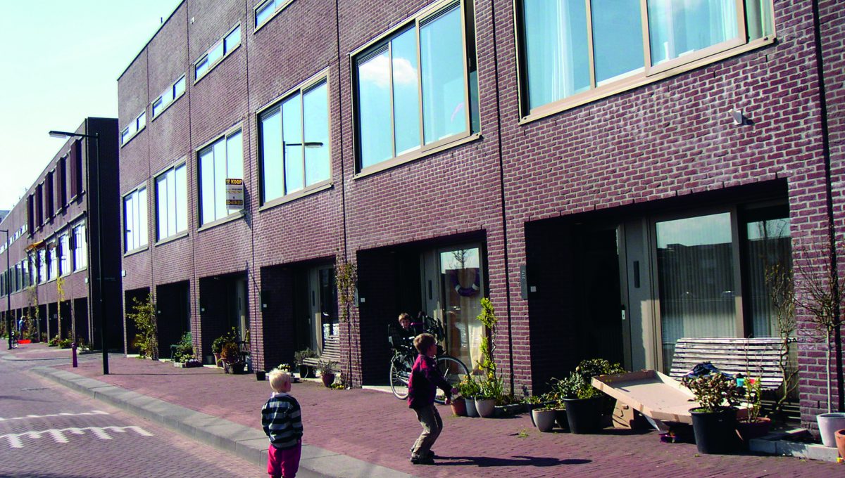 New urban housing with plinths in the Eastern Docklands Amsterdam
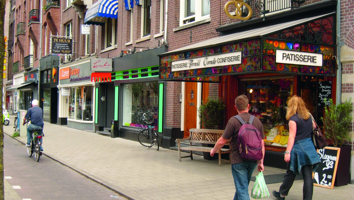 Van Baerlestraat: 19th century street with shops
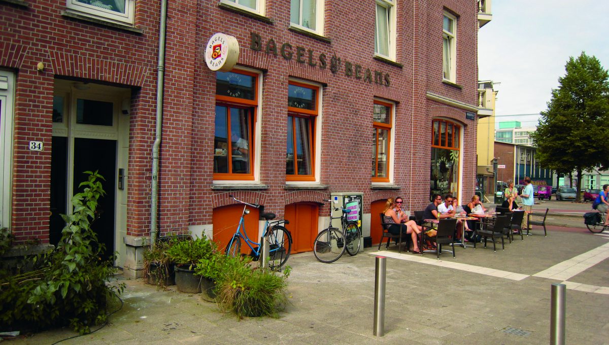 Wibautstraat: shops and coffee bars at the street corner
Most liveliness comes from the plinths with a special function such as a shop, office or other type of program other than living. Many urban neighbourhoods have these functions, often situated at a street corner or concentrated in the main street. Sometimes these streets are transformed in an extremity where the street is completely determined by shops and shopping, such as the Kalverstraat: vibrant but too crowded during the day, deserted in the evening. Success leads to monoculture and then the street becomes vulnerable.
There are several trends that affect the non-residential functions of a plinth. Nowadays our food is mainly distributed and sold in supermarkets instead of the small-scale neighbourhood shops. Supermarkets are closed boxes with an entrance of 6 meters wide, but with a depressing façade for the remaining. The supermarket is a necessity for a residential district, so it’s a challenge to fit in the urban block. Either on the ground floor with supporting shops around them, underground such as the supermarket on the Museumplein, or on the first floor as has recently been done in Amsterdam-Zuidoost.
Nowadays Amsterdam has many single households, who are biking to their favourite shops in different parts of the city to buy food specialities. For large and heavy groceries they make use of the internet-supermarket with home delivery service. This will lead to a diversification of supply in the cities: the bulk order over the Internet and via the supermarket delivered to your door, and the personal shopping in the small shops: the Turkish bakery, Italian caterers, etc. These shops go back to the size and scale of the 19th century city, a size that people recognize and appreciate. The owners of these shops are independent entrepreneurs, not part of big organisations like supermarket chains. The kind of city we are talking about is probably not generic. It is attractive for those who want to be as independent and self-supporting as possible. The city of Amsterdam cherishes this niche of society.
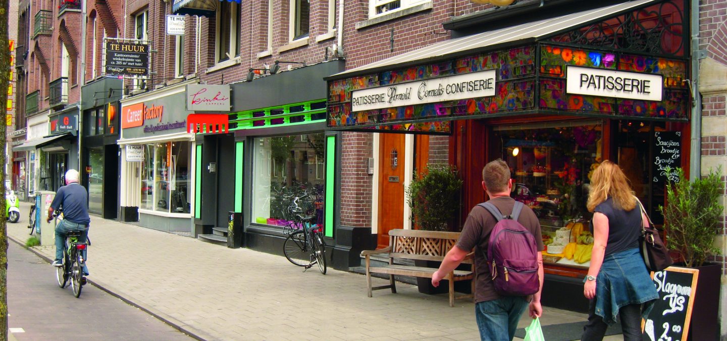
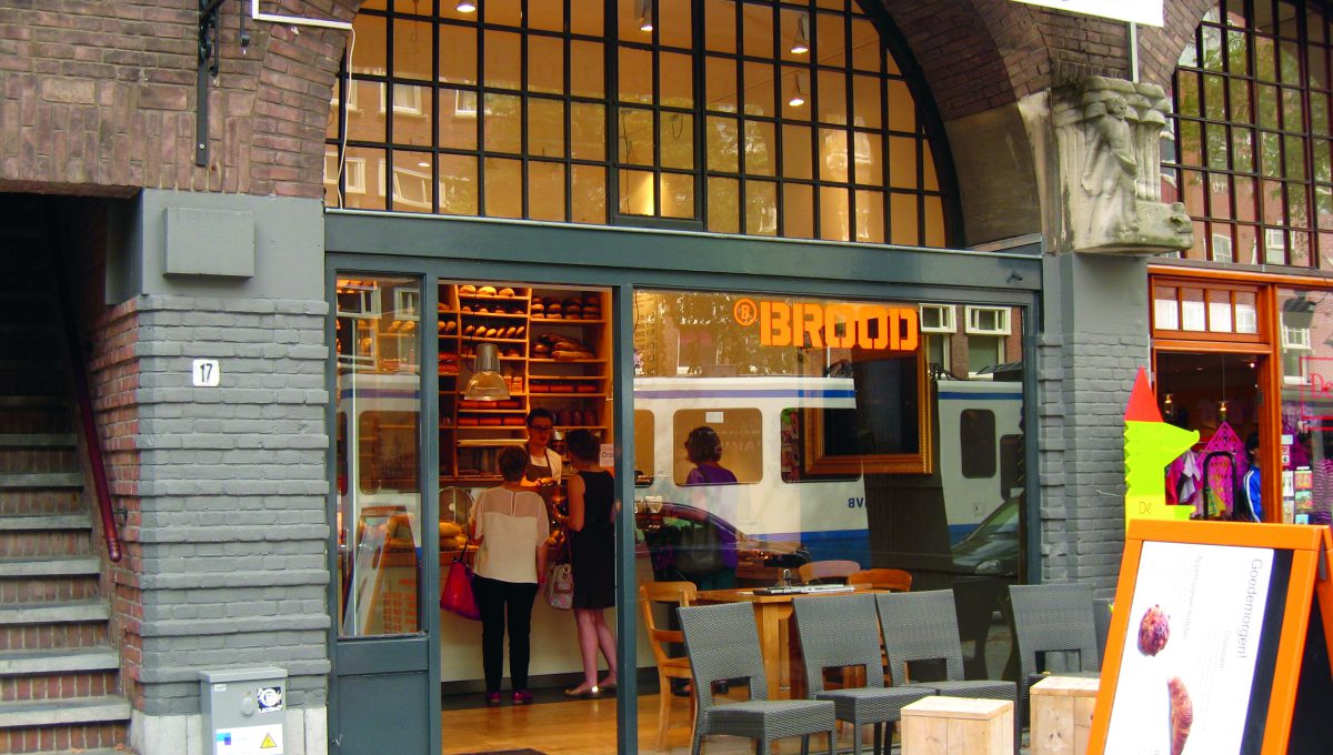 Specialized and small scale shops, such as a bakery
Interested? Join The City At Eye Level and share your story!
Discover more