Keep up with our latest news and projects!

An important cause of poor housing and living quality in the post-war Dutch residential areas is the unattractive appearance and misuse of the plinths of many residential buildings. The post-war areas have been developed from abstract urban conceptions at a district level with merely programmatic targets. The daily use of the dwelling, surroundings, and streets were regarded as less important. But precisely in the everyday use a good plinth is of crucial importance. Fortunately, we can still change things that are 50 years overdue.
The plinth is the connection between building and surroundings. Design, programming (land use), and organisation of the ground level of a residential building determine not only the impact the building has on its passers-by. Those characteristics also determine the extent to which the area functions.
During the post-war reconstruction period there was much attention for the typology of the residential building. Architects and planners of the day sought an optimal organisation of floor plans, routing, and orientation of the dwellings. They paid also a lot of attention to new, open urban design. But in many cases the crucial link between the dwelling and the neighbourhood – the plinth – was not designed carefully enough. The ground floors of many residential buildings did not take advantage of the way they are allocated.
Today, these buildings and neighbourhoods struggle for a positive image. In order to revitalise them, we often have to focus on the plinths. In short, we can do this in three different ways:
a. strengthening and optimizing the original plinth setup;
b. adjusting the plinth setup to the existing allocation;
c. adjusting both the plinth and allocation.
Each way depends on the kind of problem that is to be resolved. The following examples are from the portfolio of Van Schagen Architekten:
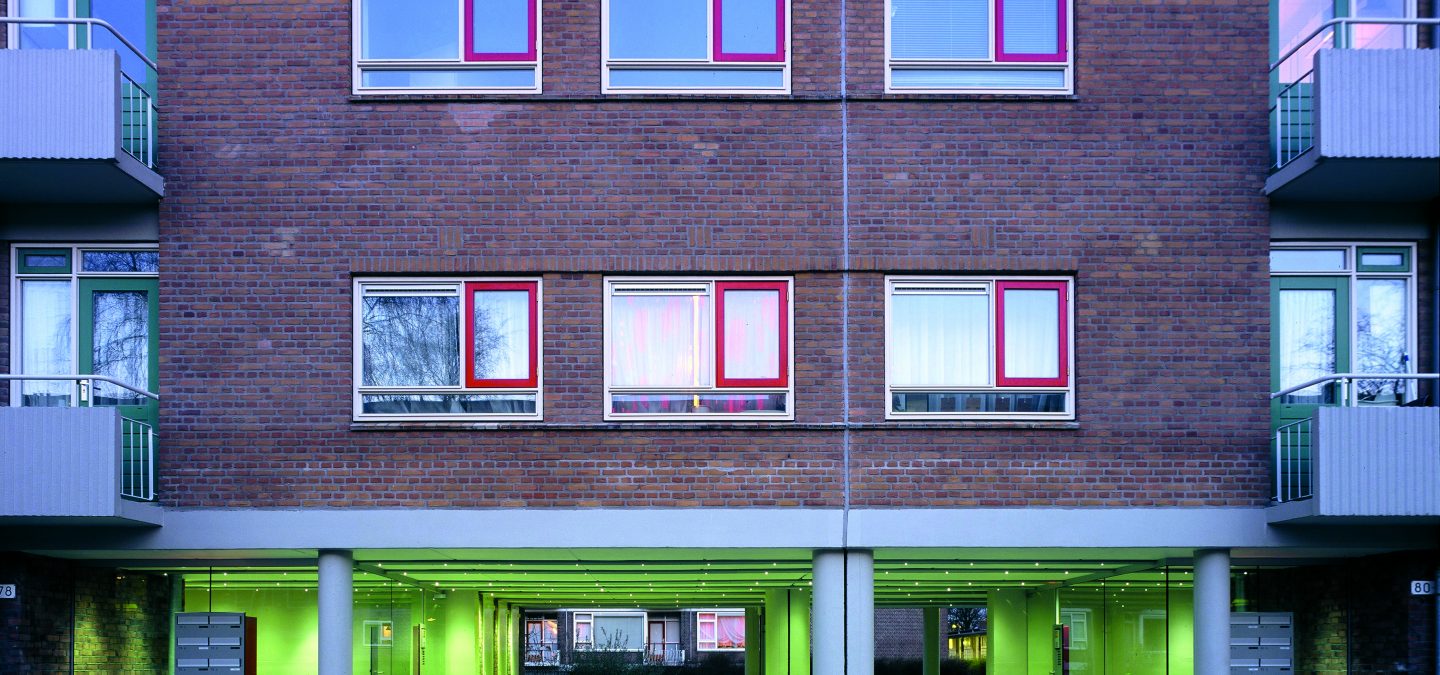
The Vissenkommen (“Fishbowls”, a nickname due to the form of the windows) in Rotterdam Pendrecht are characterised by an open ground floor, only used for small storage rooms and entrances to porches. The openness of the plinth is a fundamental element of the urban plan: permitting the connection between inner courtyard and the street, which in the original plan both were planned to be the playing field for the children from the residential buildings. Due to the diminishing of households
with children in these residential buildings the openness in and around the porch entrances turned into breeding grounds for trouble/ nuisance. The refurbishment of the plinths in the year 2000 focused on preserving the connections and transparency of the ground floor. At the same time the introduction of new materials made the borders between public and private clear as glass, literally. The distinct architecture of the building, also created by a strong distinction between the plinth and the floors above, remains dominant to the modest adaption of the plinth.
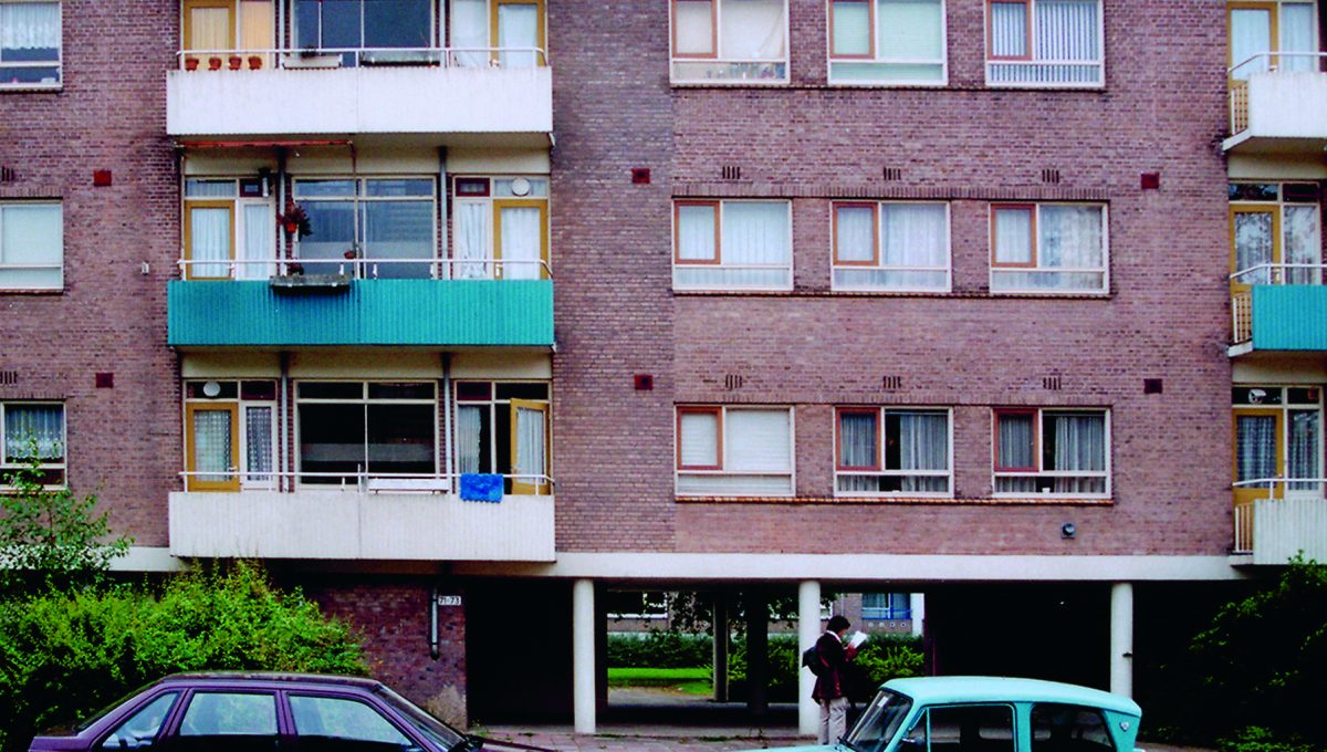 Pendrecht, Rotterdam (Vissenkom) Before
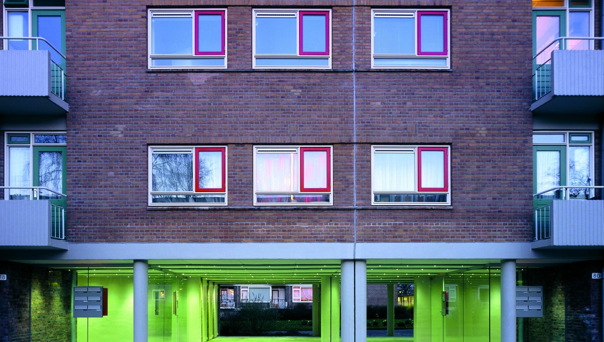 Pendrecht, Rotterdam ( Vissenkom) After - © Stijn Brakkee
In different projects we focus on benefiting from the chances that allocation offers to improve both the use of the environment and the residential programme of the building. Sometimes all what’s needed are relatively simple interventions. Other times, it requires a stouter reorganisation of the plinths of the building.
In Schuilenburg (Amersfoort), green strips are located between the residential buildings. Originally they were not reachable from the building, so they were not used and had no meaning. A reorganisation of the ground floor, in which garages were removed, offered the possibility of a two-sided entrance. The architectural principal plan (plinth and the floors above) were enriched with a high-quality use of the new plinth programme with open façades, good lighting, and aesthetic tiling. The apartments above were renovated while being inhabited.
In Enschedelaan (The Hague) the residential buildings were built in a row structure (front side faces back side) so all apartments are oriented towards the sun. The green inner yard is not accessible from the residential blocks and has no direct functional use. In the renovation of the complex the ground floor is merged with the first floor into
plinth maisonettes with a front door to the street and a garden on the backside at the inner yard. The remaining part of this yard is used for a community playfield, reachable from the surrounding private gardens and from the lift hall. With this reorganization the residential building links better to its environment with direct entrances at the street. However the characteristic architecture of the buildings as distinct blocks has been preserved. The old balconies and galleries are turned into private verandas that function as intermediate between street and dwelling.
Complex 50 (Amsterdam Osdorp) is also built in a row structure (“strokenverkaveling”). The ground floor consisted of porch entrances, storerooms, garages, some small apartments, and a narrow and low underpass. The two lower floors are completely reorganised. The principal intervention is a maisonette with its own front door at the street and a garden at the sun side. Despite this notable programmatic intervention over two floors, the main setup in the architecture (a plinth of one floor with a different world above it) is still preserved, because of the good proportioning and characteristic image. The content obviously has been adapted to the new use.
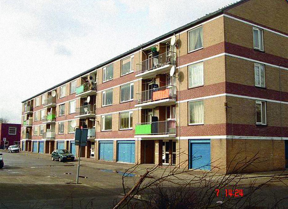 Schuilenbur, Amersfoort, BEFORE
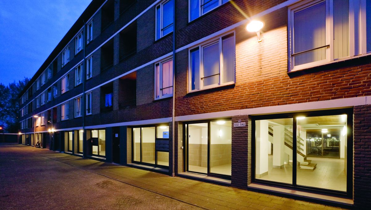 Schuilenburg, Amersfoort, AFTER - © Stijn Brakkee
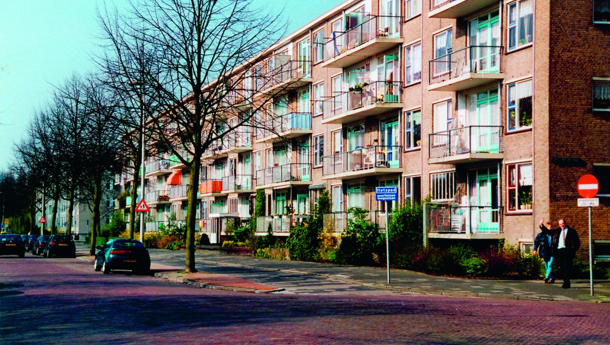 Enschedelaan, The Hague, BEFORE
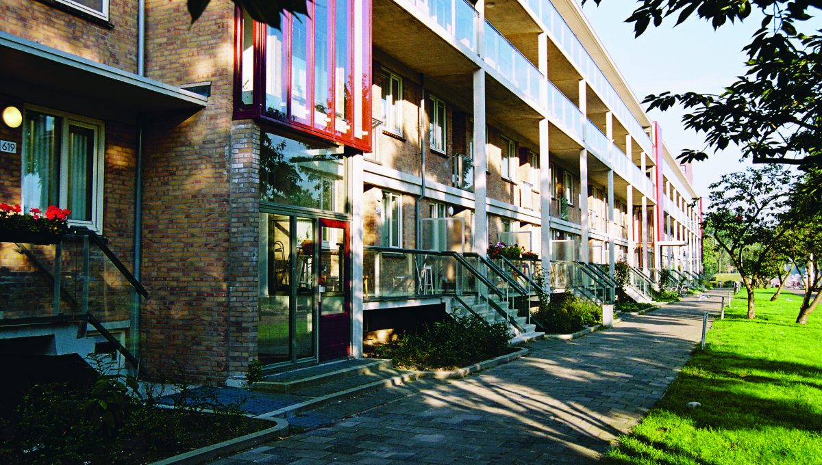 Enschedelaan, The Hague, AFTER - © Stijn Brakkee
The urban plan of Amsterdam-Bijlmer was made for residential blocks on piles (the well-known Corbusian ‘pilotis’), so that the green landscape could ‘flow’ underneath the buildings. Those piles have however never been built. The ground floor of the famous hexagonal ‘honeycomb buildings’ consisted of storages, at some places interrupted with an underpass. In the renewal plan of the F-neighbourhood, the remaining parts of the high-rise buildings have been included in a new allocation of streets and closed building blocks.
In order to include the high-rise in this urban set-up, a new programme and image has been developed for the plinth of the Florijn-building. By expanding the ground floor space has been created for a new programme of atelier dwellings, entrances, business space and patio dwelling in the ‘plinth of the building. Within the volume, hardly visible from the street, space has been found for storages and parking. In the plan we focused on preserving the former inner-street. Here we situated the living rooms of the plinth apartments, allowing sufficient distance between living and the public domain while also creating openness and nearness in relation to the street.
Interested? Join The City At Eye Level and share your story!
Discover more