Keep up with our latest news and projects!

Many cities are developing new urban inner-city areas instead of suburban sprawl. These new areas (or the redevelopment of existing areas) have an urban look and feel: higher density, more amenities, a mix of housing types and other functions. What’s most important for new urban areas is to create a pleasant city at eye level and a lively urban neighbourhood with good walkability.
However, not all new development areas in the Netherlands are succeeding in this aim. They lack diversity in terms of function, variety in architecture and/or good design of the plinths. The development of high density urban projects is complex, but it should always interact with the street at the ground floor level. Many projects seem to have lost sight of the human scale and experience. A pleasant experience at eye level depends on many aspects (Karssenberg et al., 2016), all which need to be taken into consideration while developing and designing these new areas.
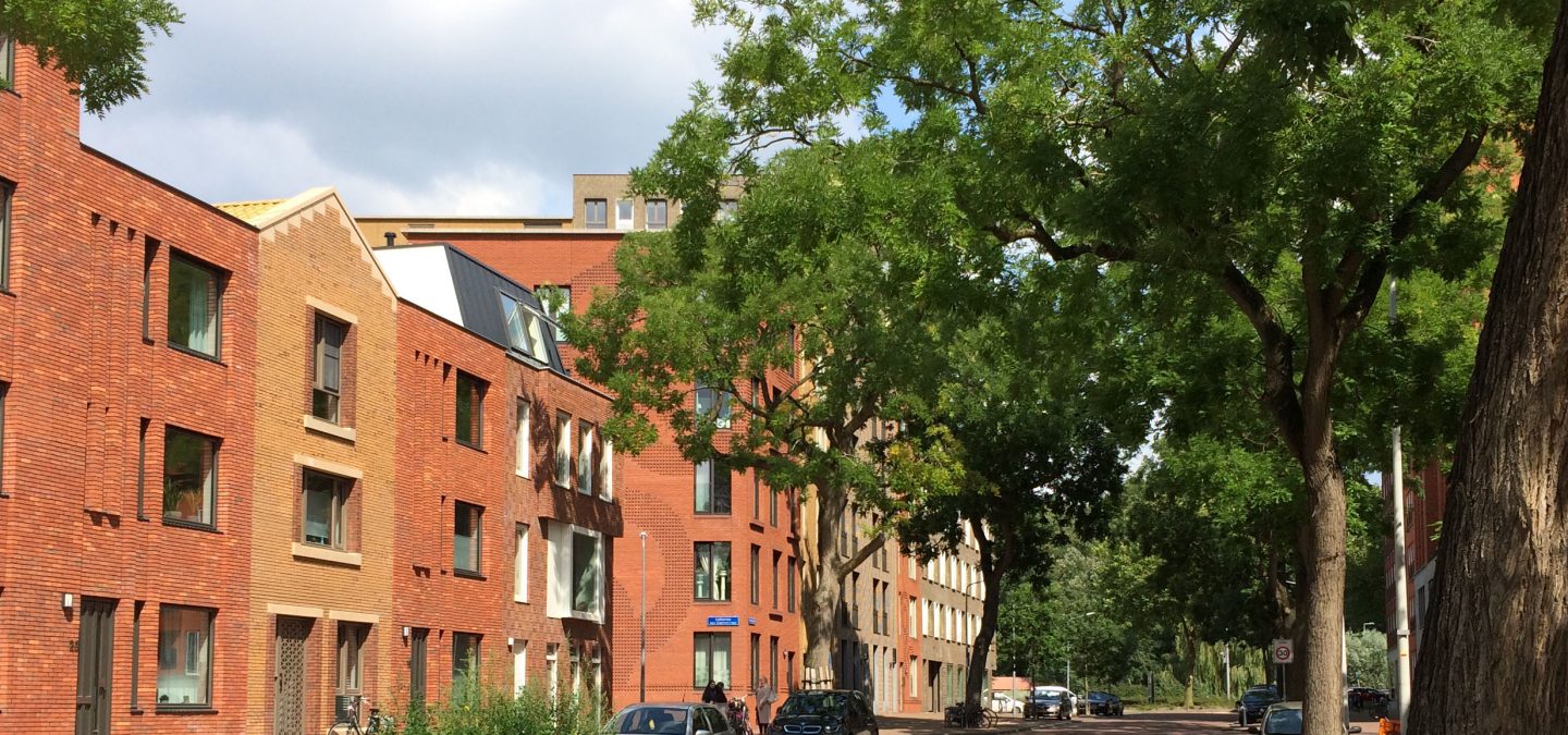
Jane Jacobs’ 1961 book The Death and Life of Great American Cities has demonstrated that there are four indispensable conditions when it comes to generating exuberant diversity in urban districts. First, there’s the need for mixed use: more than one primary function. Second, blocks must be short to create a fine urban grain in the street network with many corners. The third condition is the need for diversity in buildings, both in terms of age and condition. And four, sufficient density and concentration of people. Jan Gehl’s Close Encounters with Buildings, published in 2006 has also provided us with many insights regarding life in between buildings, one of which is that the design of façades should appeal to pedestrians. Interesting façades have variety, multiple doors, visual contact and many functions.
Current new-build projects in the Netherlands reveal that creating a great city at eye level still faces challenges. An analysis of newly developed areas (or under development) in Amsterdam (Zuidas), Utrecht (Stationsgebied) and Rotterdam (Wijnhavenkwartier, Laan op Zuid, Katendrecht, and Nieuw Crooswijk) has provided us with new insights – which build on the knowledge of both Jane Jacobs and Jan Gehl’s works. We found the following aspects to be important in creating a pleasant city at eye level.
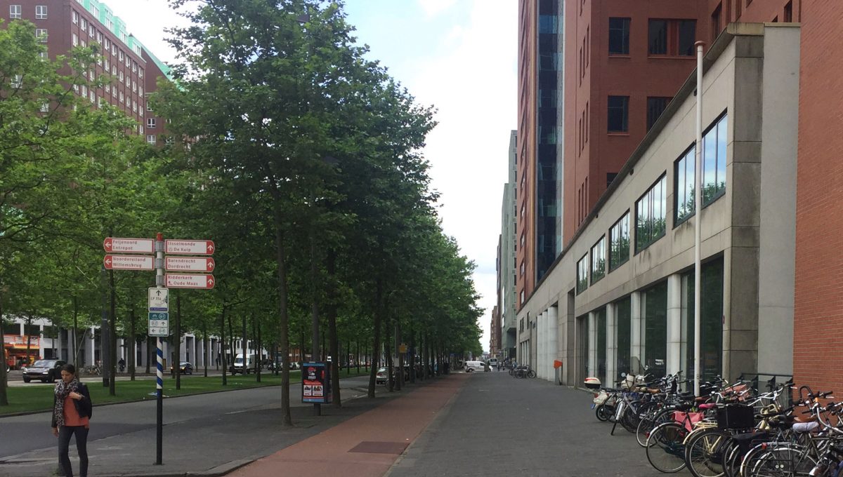
 Street without trees - © STIPO
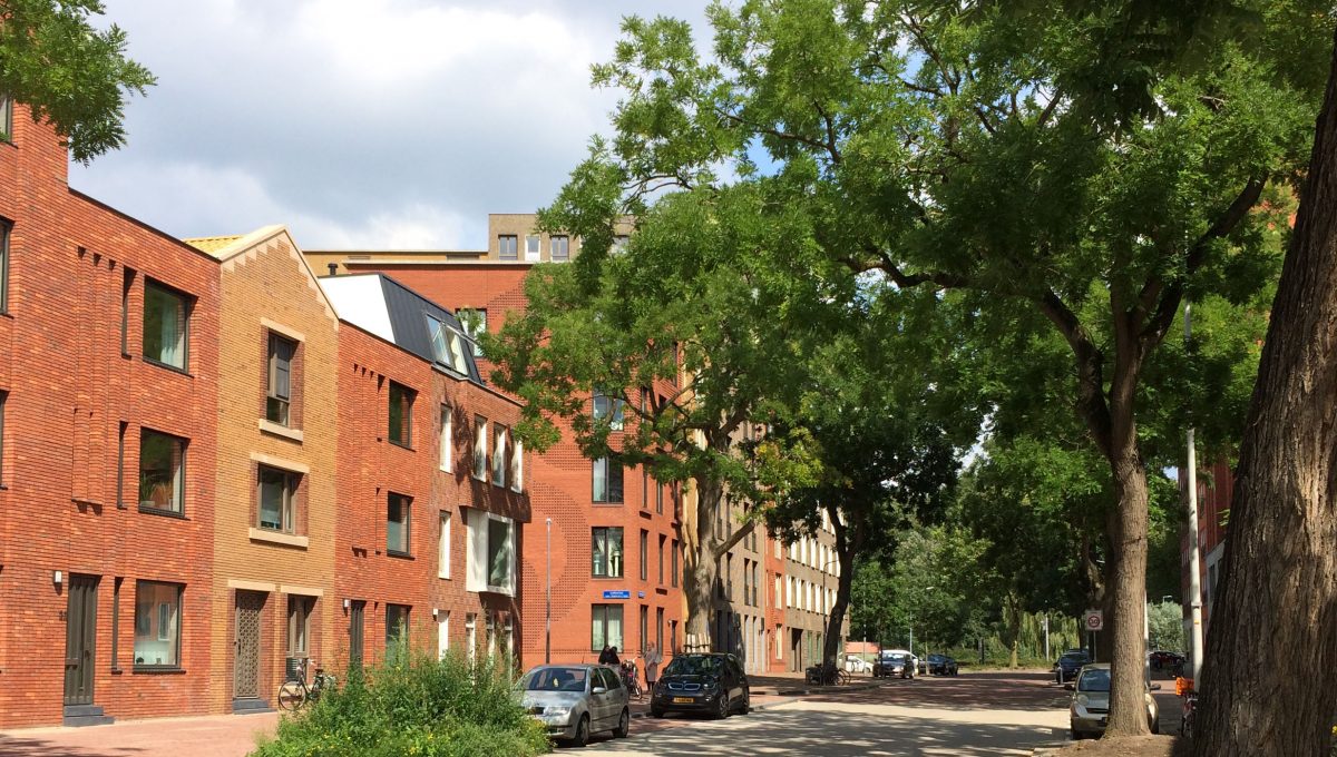 Trees form a canopy in the street - © STIPO
Street width is important. Of course, this depends on the functional requirements and the hierarchy in the street network. However, some streets tend to become too wide, creating a feeling of emptiness and loneliness. For urban streets, a width of 13 to 20 metres seems to be just right for traffic, sidewalks, trees and a well-functioning hybrid zone. If a street is wider, a green zone should be added.
Trees are important for the character of a street. Every street should have trees on at least one of its sides and if possible on both. They function as a canopy for the street, creating a green atmosphere and providing protection against different kinds of weather (shade, for example). Trees also help to diminish the urban heat island effect and provide space for urban nature.
The sidewalk shouldn’t be too narrow, nor should it be too wide, approximately 2.50 to 3.50 metres. Space for parking bicycles should be part of a functional zone on the sidewalk (together with space for trees, lamp posts and benches, for example), and not limit the width of the sidewalk. This functional zone is also a buffer between cars and pedestrians. If necessary and possible, parking for visitors along the sidewalk can be considered, but this shouldn’t be the dominant feature of the street. Be careful not to park cars on the sidewalk because this can be unsafe for playing kids.
 Sidewalk that's too wide - © STIPO
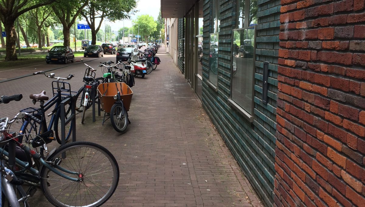 Sidewalk that's too narrow - © STIPO
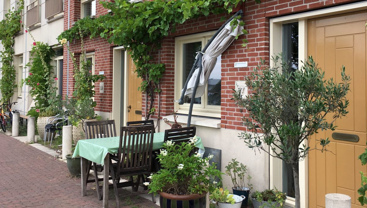 The hybride zone - © STIPO
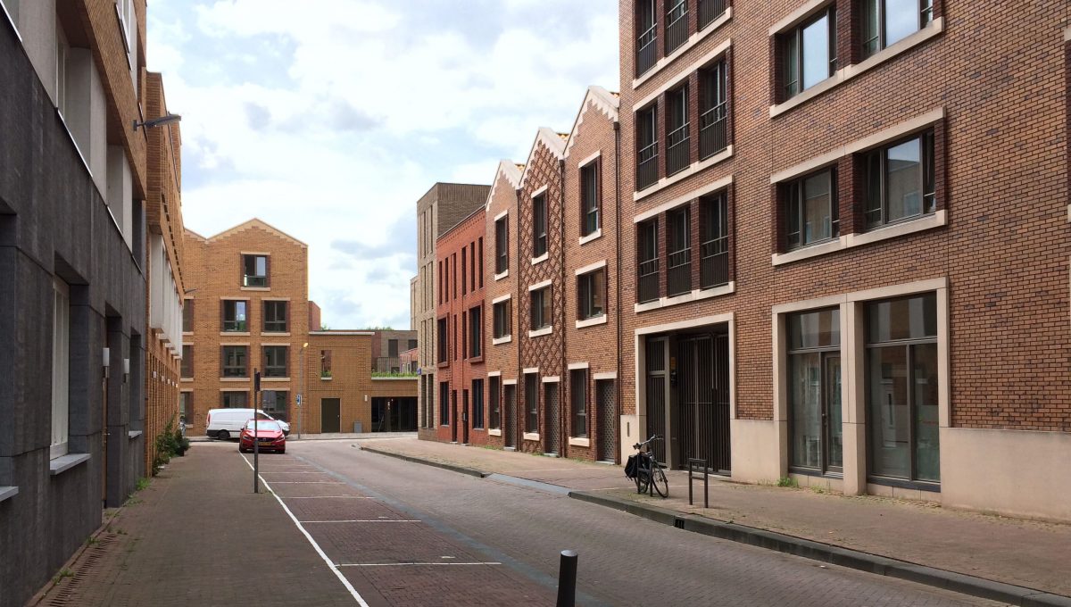
The size of the urban blocks should have a human scale, both in length and height. Small blocks create more variety in terms of the walking route with many corners for (neighbourhood) facilities. Urban blocks should also have a variety of units: something new every 5 to 7 metres. Many doors and entrances also create more opportunities for encounters and enhance the variety of the building. For future possible uses, urban blocks should have a flexible ground floor: physically (height at least 3.50 metres) but also in the zoning plan (residential, business and small-scale amenities). Corner units should be prioritised for adding special functions.
Ground floors must have active functions facing the street: shops, cafés, workspaces, kitchens and living rooms, for example. Dwellings and units on the ground floor also should have a separate front door to the street (not combined with entrances for apartments on other floors). A slight elevation of the ground floor (a maximum of 40 centimetres) can provide the right height for privacy for ground floor dwellings, while keeping eyes on the street. A hybrid zone (or façade garden) can also create privacy for ground floor dwellings, and they enhance ownership of the street.
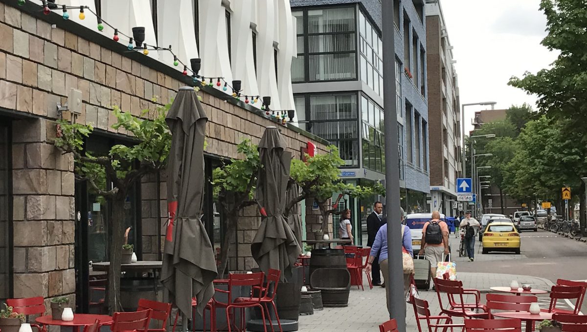 Human scale architecture - © STIPO
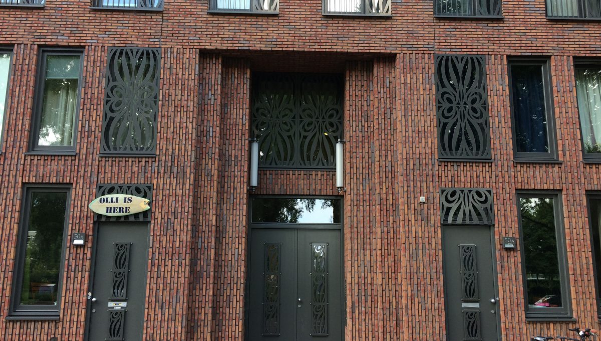 Warm and tactile architecture - © STIPO
The design and appearance of the ground floor should appeal to the pedestrian, something Jan Gehl calls the 5 km/h architecture. Both the functions and the architecture should be attractive and add to the walking experience by creating variety. Architecture should be warm and tactile (brick, brownstone or natural stone, for example) and have considerable detail. The design should not dominate either horizontally or vertically but have a great mixture of both, creating variety and maintaining a human scale while enhancing the overall cohesion of the architecture. Creating a variety of functions and uses in the plinth requires plinth management, such as in Amsterdam Zuidas. It needs a dedicated plinth manager to identify those functions that are missing and what’s needed in the area, which will increase the use of the plinth.
The plinth should create a smooth transition from building to public space. The façade should have an openness, not by having lots of glass but rather a permeability between inside and outside. Big windows are undesirable as they either reflect and act as mirrors or violate the privacy of inhabitants and make them feel like they’re living in an aquarium (thus causing them to close their windows with curtains or blinds). Creating smaller windows enhances people’s feeling of privacy and provides space for more materialisation. Medical amenities such as doctor and dentist services tend to blind their windows for privacy reasons, creating dull façades. Instead they should only be allowed to have a reception desk and a waiting room on the street side.
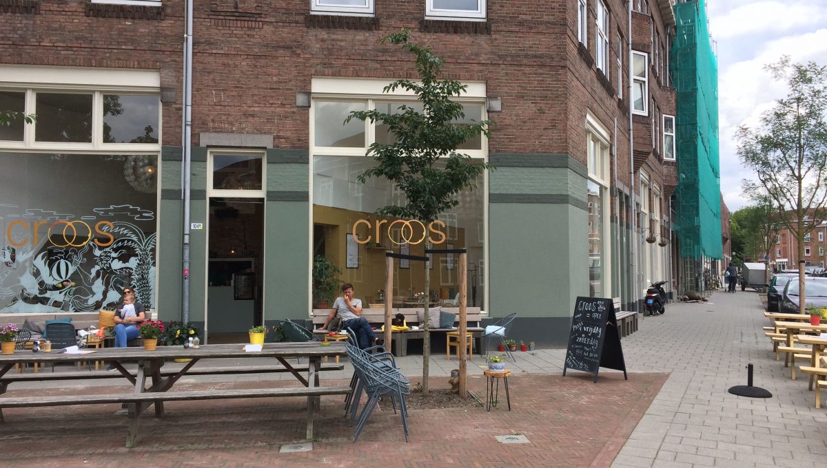 Café on corner - © STIPO
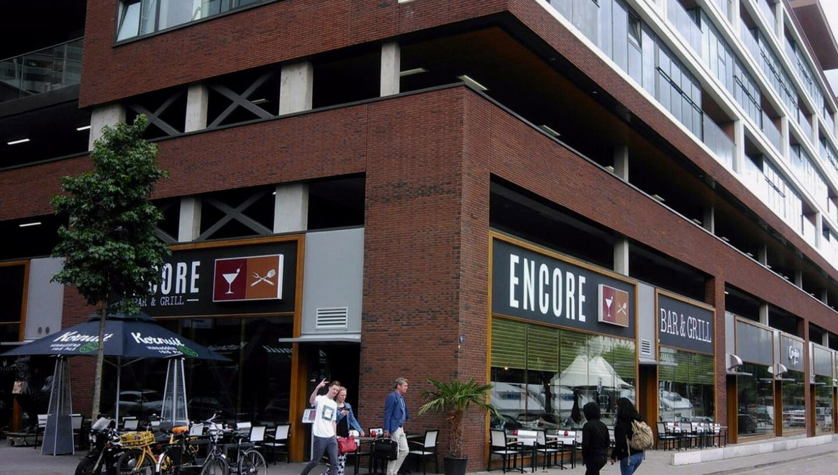 Mix of functions - © STIPO
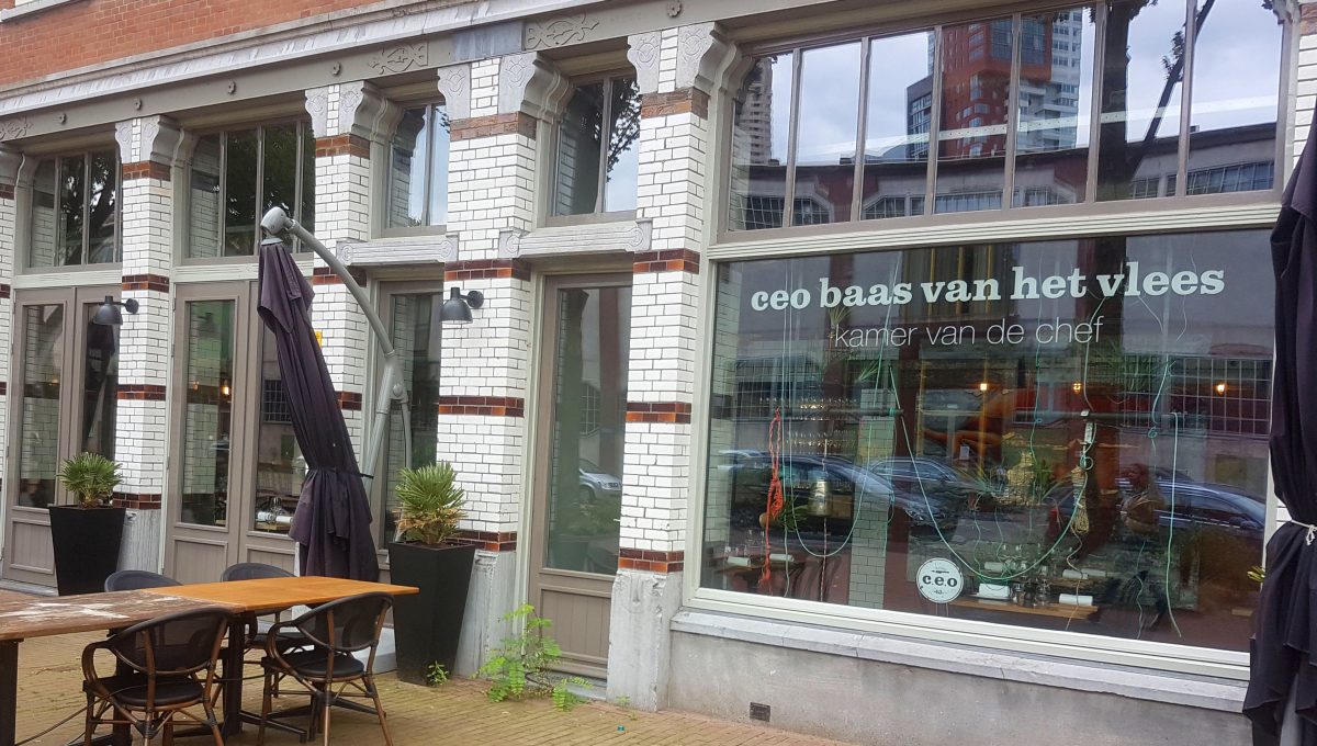 Nice façade and window size - © STIPO
Interested? Join The City At Eye Level and share your story!
Discover moreThe creation of a good city at eye level over the years is depends on the hardware, software and orgware: