Keep up with our latest news and projects!
The North Gate of Taipei (Beimen) was hidden under a bridge for years. The Taipei West District Gateway Project made this historic site visible to all once again. Through the Beimen Street Sign Project, the surrounding area received an upgrade, revealing the street’s original historic fabric, and transforming its street signs.
What was unique about this project was the level of community participation in the design process. Local consultant firm Vision Union used the topic of street signs as a starter to involve residents and businesses in discussing public space; the interface between public and individual life. A bottom-up approach was used to decide on a new streetscape and to create a new design method for the future management of the street and its advertising.
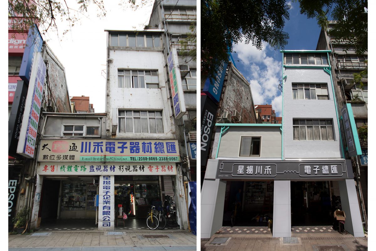
In Taiwan, almost all urban areas are a mix of residential and commercial properties. Therefore, business activities exist in almost every block and street. Shop owners try their best to attract customers by using bright and flickering neon signs. This makes Taiwan’s urban street landscape seem disorganised and adds to citizens’ eye fatigue.
To solve this problem, Taipei City government published a series of sign-setting regulations in 1996. Beimen Camera Street was one of the areas that was subsidised by the government to renew all its commercial signs. However, it soon became apparent that there was a big gap in perception between what the government and the local residents thought commercial signs should look like. Regulations were poorly executed, and the street landscape struggled to improve.
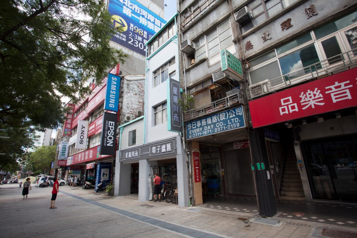
In 2016, as part of the Taipei West District Gateway Project, the Zhongxiao Bridge approach was dismantled. As a result, the North Gate of Taipei (Beimen), which had been hidden under the bridge for years, could finally be seen by citizens. It revealed the original urban landscape, connecting Beimen to other historic sites such as the Beimen Post Office, Mitsui House and the Qing Dynasty Arsenal.
Phase 1: reforming the image
Vision Union, a consulting firm dedicated to building up sustainable relationships between humans and the environment, proposed a community-led process to transform the image of commercial signs in Beimen Street. The aim was to educate and empower the community to propose alternative designs and to set up a practical regulation for commercial signs that can improve the urban landscape.
Phase 2: finding common ground
Based on existing regulations and discussions with the designers and makers, Vision Union introduced concepts of active and passive control. Active control involves setting up restrictions and limitations, including sign position, scale, measurement, and lighting, while passive control chooses to avoid extreme situations and provide recommendations, including colour and fonts. The community decided on the passive control approach and proceeded with collective design discussions.
Phase 3: expanding the imagination
After the series of workshops, it was time to attract local shop owners and extend conversations. In this phase, they gathered the community’s ideas and visions for the future. Issues on the agenda during the workshops included: local lifestyle, development, landscape, and street signs. Together they voted on the most important and urgent aspects.
Through this process, Vision Union found out that issues like ‘Aesthetic education,’ ‘Pedestrian Flow’ and ‘Sign restrictions’ were what mattered the most to the community. Following this, they invited professionals of urban planning, urban design, architecture, landscape, marketing, and advertising to discuss ideas with the shop owners that participated and to help them understand the value of design for the overall urban street landscape and development. These workshops helped break the ice between designers and shop owners and made the redesign action easier to complete.
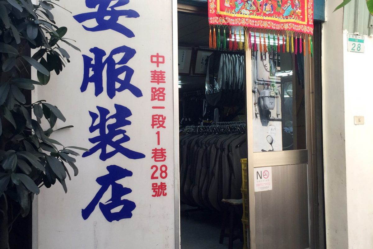 Tailor shop before
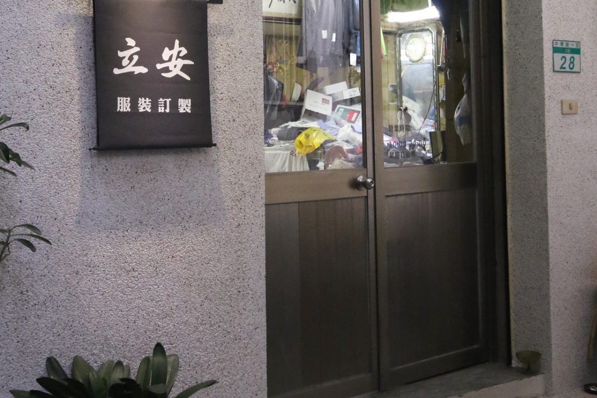 Tailor shop after
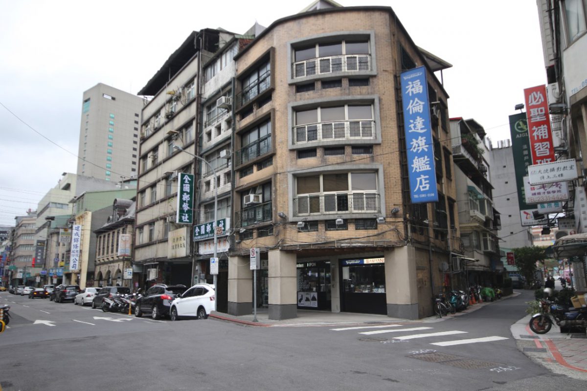 Car Parts Retail Founding Store before
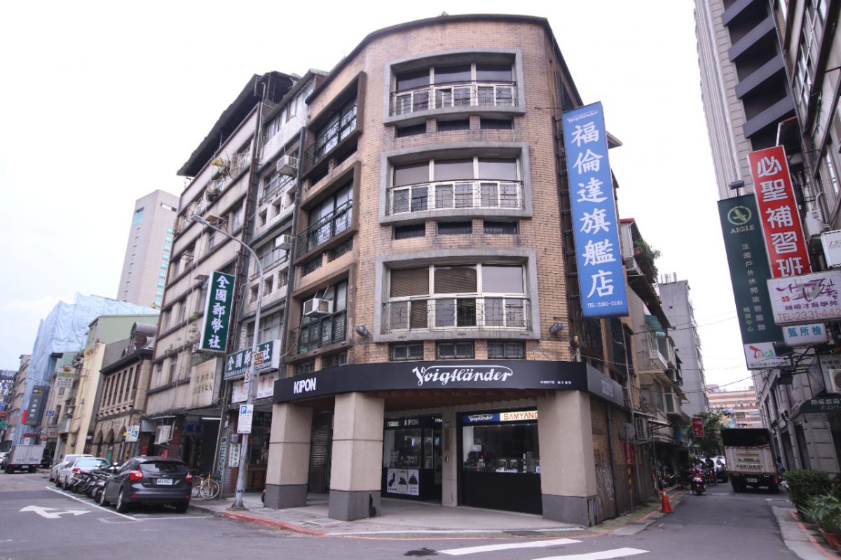 Car Parts Retail Founding Store after
The project redesigned nine commercial signs of long-time family-run businesses in the street. Each design was based on the shop’s history, iconic items or style: