Keep up with our latest news and projects!

Why is wayfinding important in a city? Why do we feel uncomfortable when we don’t know where to go? Why do pedestrians and cyclists prefer certain routes over others? And how can we seduce them to take other routes, or go a little further? To answer these questions, we have to look at the interaction between the physical environment and the people moving in it—their behaviour and sense of wellbeing. Environmental psychologists study these relationships, and underlying motivation and perception, in trying to explain behaviour in public space.
Wayfinding is probably one of the most effective ways to enhance the user experience in the urban environment. With proper design, we can help people reach their destinations in the easiest and most effective ways possible. Wayfinding design can also help prevent behaviour by guiding people away from unsafe locations, promote behaviour by stimulating people to walk a specific route, and support the local economy by attracting people to destinations that need more visitors. Two main categories of design help us reach these goals: shaping the urban environment and effective use of signage and graphic information systems. Here we look at the first. As environmental psychologists we ask: how can a pedestrian find her way in the city based on an intuitive sense of her urban surroundings?
Wayfinding is all about making decisions. When walking around we continuously decide which path to take or what direction to follow. We base our own wayfinding decisions, for the most part, on two strategies: route and survey (1). Route strategies consist of a sequence of instructions to arrive at a destination. Each instruction contains a direction to take at a specific junction or orientation point. This strategy is efficient but rather inflexible because it depends on a specific route. Survey strategies integrate a bird’s eye view of the cityscape. Knowledge about relationships between locations (e.g. distance and orientation) is used to make decision on what general direction to go and thus requires less detailed local knowledge.(2)
Since people navigate with either specific routes or a global sense of direction, the logical solution is to enhance the urban environment to support both strategies. The two basic methods at our disposal are interventions that offer more structure in the urban environment and interventions that offer more differentiation. We can offer more structure by simplifying urban morphology, aligning streets and intersections so they can be understand as part of an overall shape (e.g. a grid) or concept (e.g. the shape of a bird). Through association or perception the average person needs to able to comprehend the overall structure of the city as they move about at eye level.
Urban environments with a recognizable structure make it easy to generate an integrated bird’s eye view. But if everything looks the same, we essentially have constructed a hedge maze! So some things need to be different. Differentiation interventions promote intuitive wayfinding. Creating zones with distinct, easily recognizable identities help us figure out where we are in the city. Two other main strategies are increasing visual access (i.e., views) so we perceive linkages between different local zones and the placement of landmarks at key decision points throughout the urban landscape. In general, more differentiation can balance out a lack of structure. Vice versa is not possible.
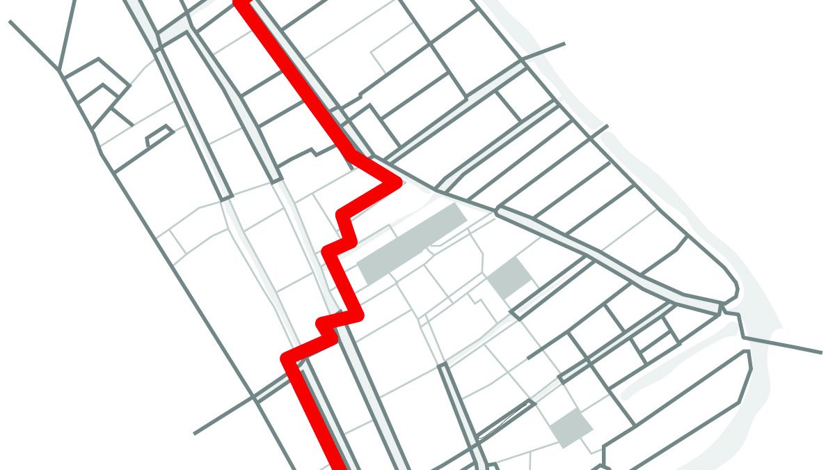
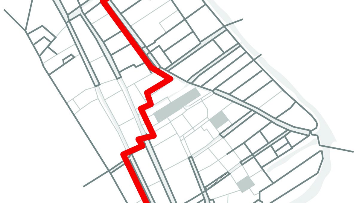 When we use route strategies, we tend to walk using directional instructions. The sequence of instructions is serial and connected to junctions stored in our memory
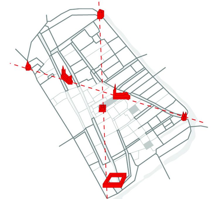 When we use survey strategies we navigate based on key reference points in the environment, for example the orientation and distance of a church or city hall.
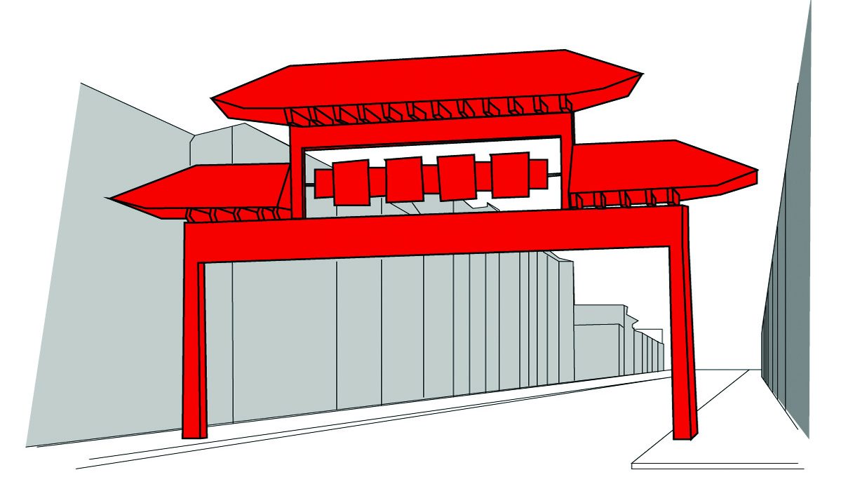 An more pronounced feature in the environment can be used to signal to people that they enter or exit a different region or zone.
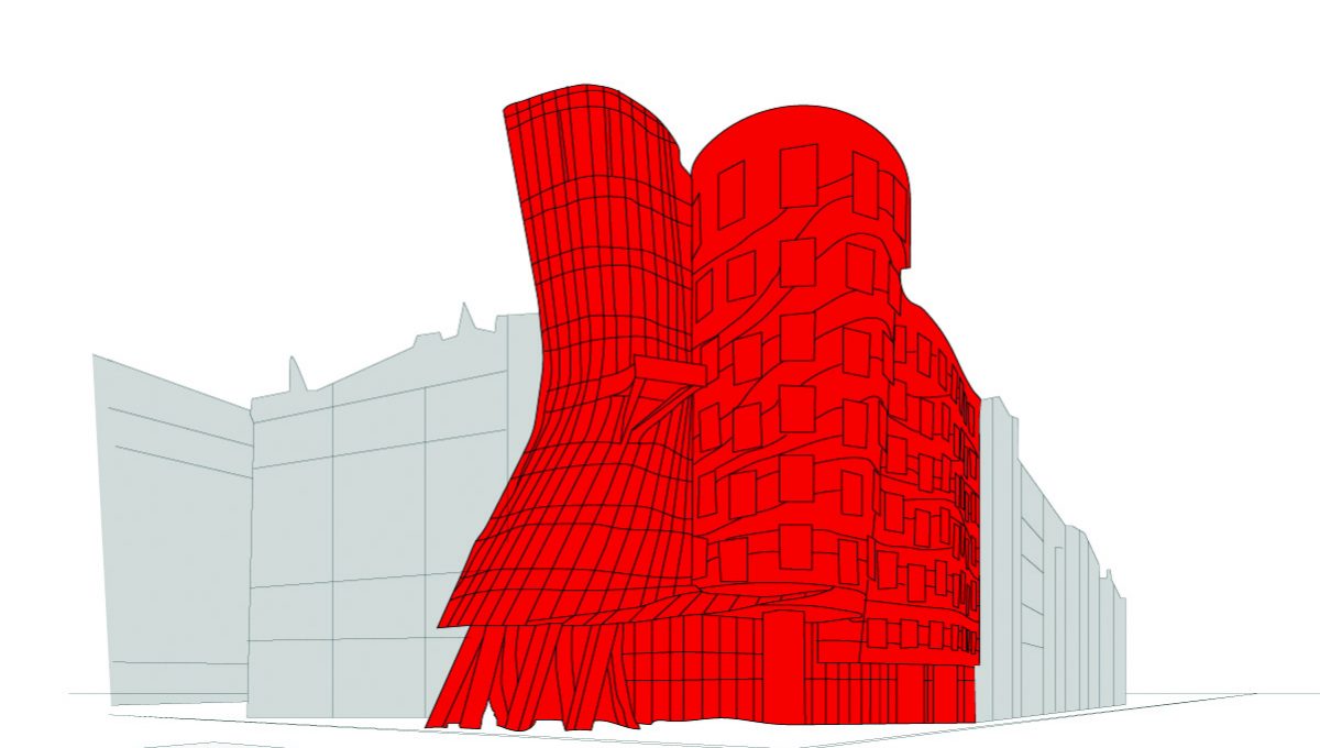 We can use architecture to add more differentiation in the environment. The dancing house in Prague act as an easily recognizable landmark that helps to know where you are in the city.
Differentiation makes us understand where we are, locally. It embeds our understanding of place, making us feel saver and in control. The key for proper differentiation is creating local spatial identities. In general it requires a three-part course of action.(3) First, we group space into destination zones based on either form or functional similarities, for example a zone where the cultural heritage of a place is accentuated or a zone where you can find your everyday grocery shopping. Second, in each zone we identify local spatial units and enhance them further until they can be sufficiently recognized by the average person as a separate spatial identity. This could mean for example that a typical feature in the local architecture is made more to stand out by accentuating its colour or shape. Third we enhance the legibility of functional wayfinding elements in the environment: identification of entrances, exits, paths and junctions. For example we make the entrance of an area stand out by giving it some different trees, or we place a statue to accentuate it is a gate.
1. Prestopnik & Roskos-Ewoldsen (2000). The relations among wayfinding strategy use,
sense of direction, sex, familiarity, and wayfinding ability. Journal of Environmental Psychology, 20-2: 177–191
2. Lawton (1996). Strategies for Indoor Wayfinding: The Role of Orientation. Journal of
Environmental Psychology, 16-2: 137-145
3. Arthur & Passini (1992). Wayfinding: people, signs, and architecture. McGraw-Hill Book
Co: p. 86.
Interested? Join The City At Eye Level and share your story!
Discover moreRecognizing the need for structure and differentiation is the basic step to enhance wayfinding. At a higher level, it requires the designer to make an engagement with the user to instil a form of intuitive meaning. Getting there involves exploring what symbols hold special meaning for the users of the environment. It requires insight into ergonomics, local rituals, personalities, cultural heritage and characteristics of place to let the identity of space resonate with the local use and culture. More resonating structures and identities are better recognizable and in turn easier to navigate. To make this a reality, effective wayfinding design cannot be ad hoc installed. But with thoughtful, meaningful research and deliberate application of interventions, every city with all its destinations could be a pleasure to walk and find your way.